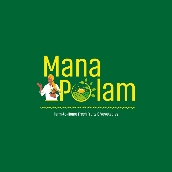
Mana POlam - Logo Rationale
The Mana Polam logo icon, with its name, represents the field, the sun depicted within the letter “O,” and farmers holding organic vegetables and fruits. It signifies the company’s mission of delivering fresh produce directly to customers’ homes. The color usage of yellow and green represents the tradition of culture, with green also representing nature. The balance of these colors evokes a sense of Rangoli art.